
Colour in the weave: three rug designs worth a closer look
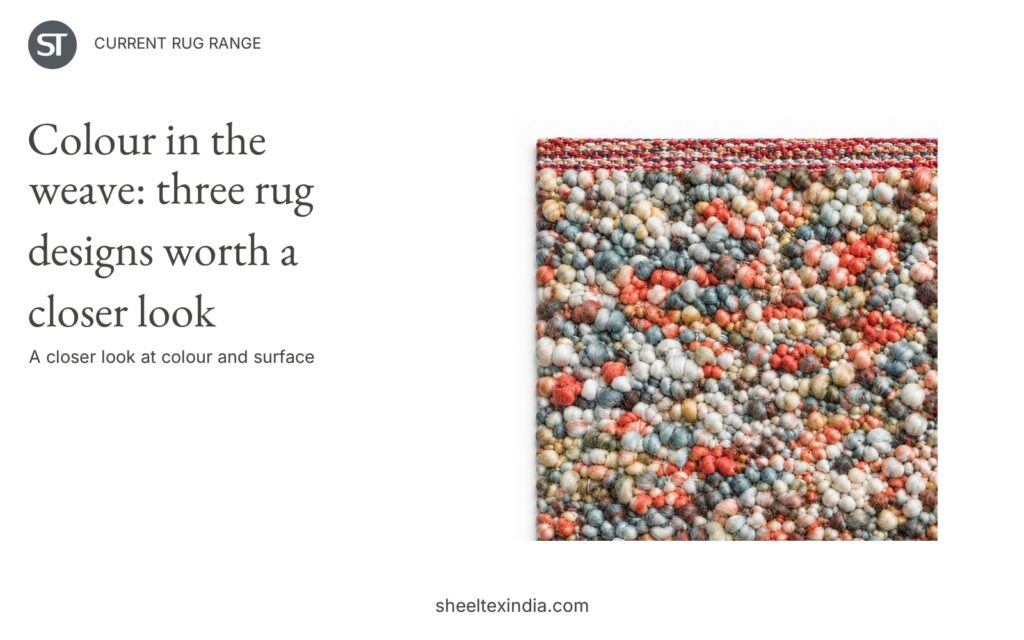
Coral, cream and grey-green sit close together in one rug sample. Another gives the colours more space, with larger loops and pale fringed ends. A third arranges bright shades in rows between bands of white. In these three designs from Sheeltex’s current rug range, colour and surface create quite different looks.
For a retail buyer selecting colourful textured rugs, the useful distinction is how the colour appears: finely mixed across the face, broken into larger loops, or organised into stripes.
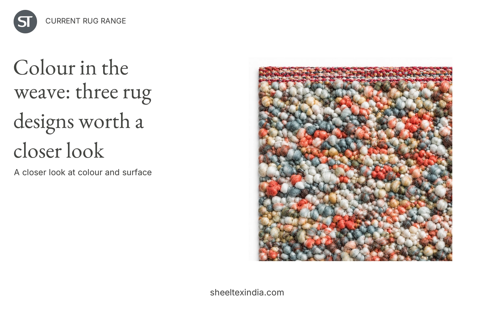
The photographs below show the actual samples and their details. Compare the colour arrangement and edges as well as the texture; the samples are shown separately and are not a comparison of finished rug sizes.
1. Small-scale colour across the surface
This wool design has a densely patterned face made up of small rounded forms. Pale coral and cream are mixed with grey-green and blue-grey, so the eye moves between many small changes rather than following one large motif. A narrow, multicoloured edge repeats those shades.
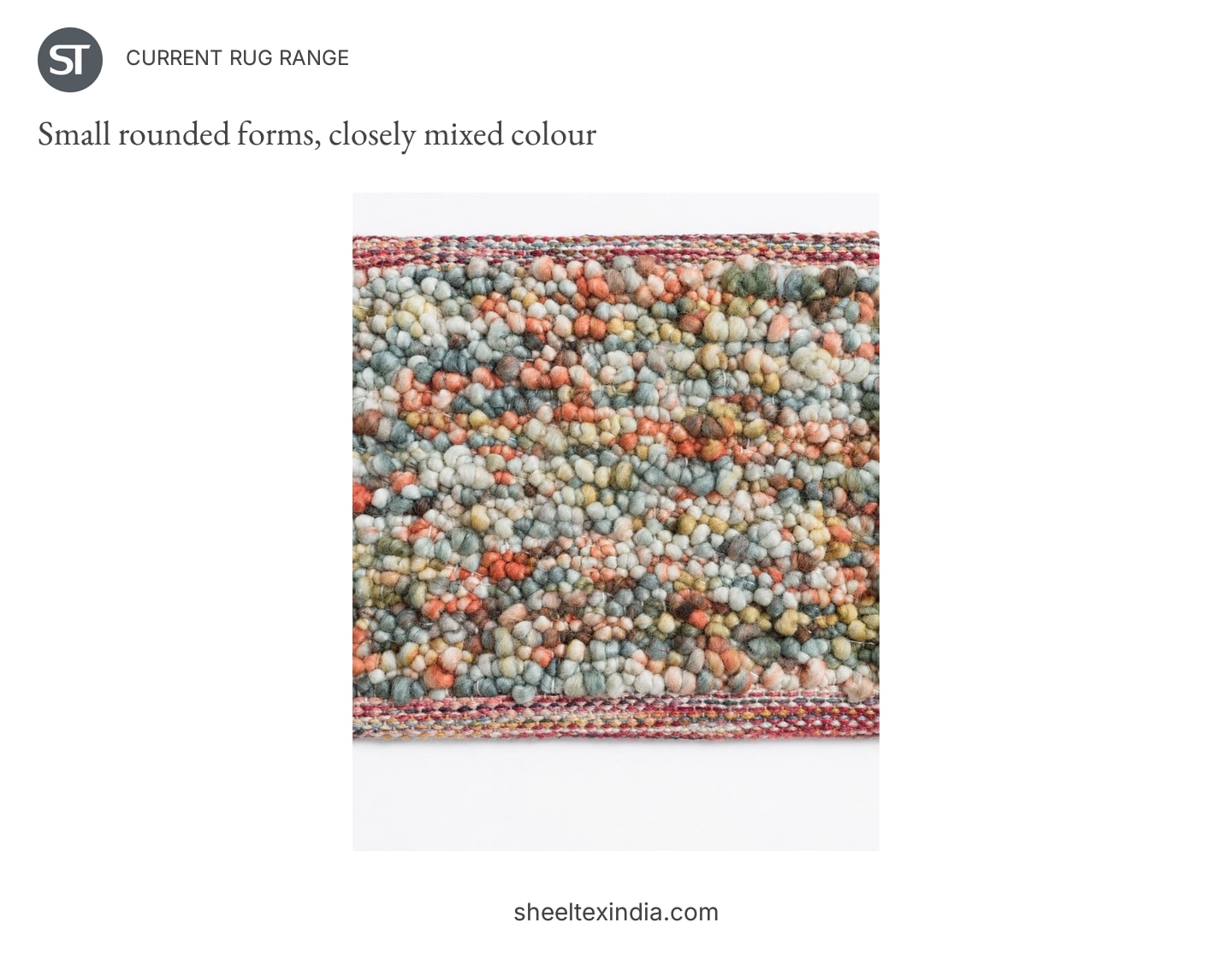
The close view in the header brings out the rounded surface. In the wider photograph, those individual colours settle into a more blended appearance. That difference matters when choosing the image for a retail page: a detail can explain the surface, while the wider view communicates the overall colour balance.
This would be the first design to shortlist for a range built around muted colour. Plain clay-coloured or grey-green cushion covers could pick up a shade already present in the rug. Cream would give a quieter pairing. These are styling suggestions drawn from the sample’s palette, rather than matching products shown here.
There is still plenty happening on the face. Alongside a large floral print or another tightly patterned textile, the small colour changes may be harder to appreciate. Give the sample some space beside plain fabrics when deciding whether its fine texture adds the right amount of detail to the range.
2. Larger loops and a pale frame
The second wool design makes the individual loops much more visible. Ivory, tan, mustard and blue-grey appear in a looser arrangement, with darker pieces standing out between the pale ones. The pale end sections and fringe give the coloured centre a clear boundary.
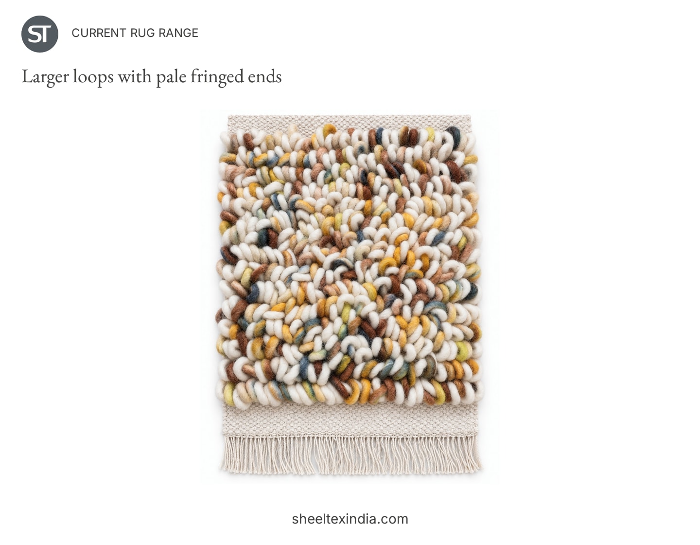
Its interest is in the shape of the surface as well as the colour. Compared with the first design, there are fewer closely packed, small forms for the eye to read. The larger loops create more distinct light and dark areas in the photographed sample.
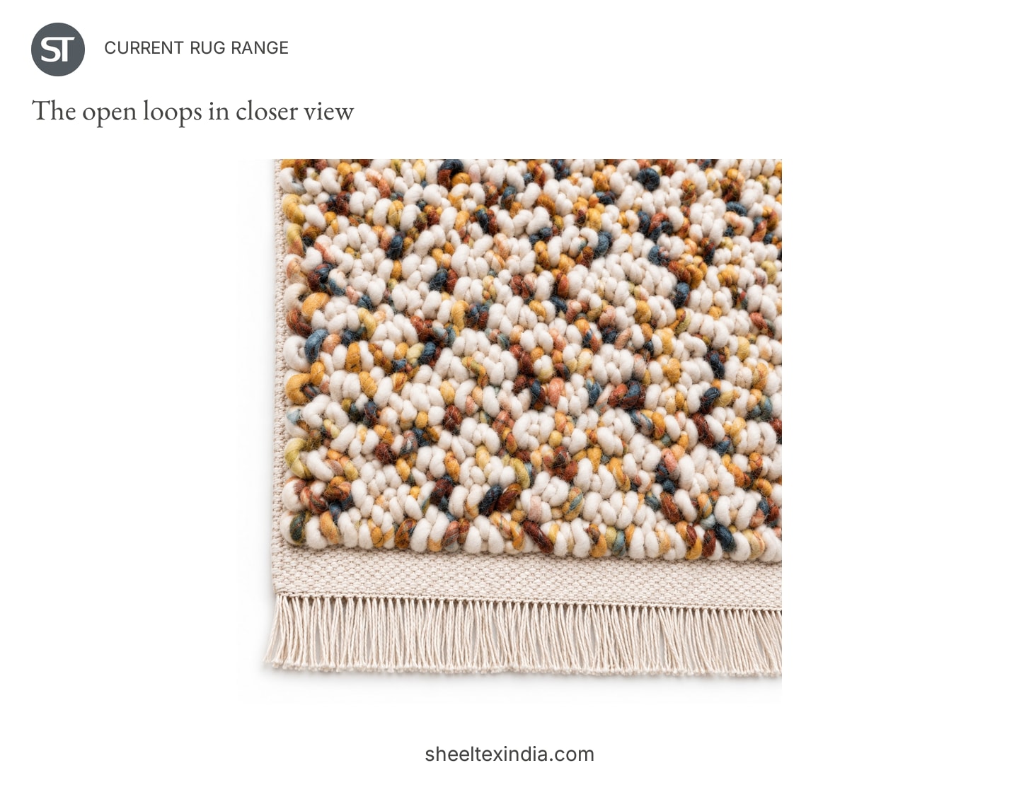
For a retail selection, this is the stronger candidate when the surface itself should be prominent. A plain mustard or blue cushion cover could draw attention to one of the scattered colours without introducing a second pattern. A simple fabric texture alongside it would also leave the loops easy to see.
The fringed ends deserve a place in the product presentation. A tight crop of the centre alone would make this look closer to the first rug than it is. Showing the whole sample makes the framing visible; showing the detail explains the larger loops. Both views help a buyer decide whether this more pronounced surface suits their collection.
3. Bright colour in repeated rows
The third design changes the pace. Red, blue, green and yellow sit in repeated rows between raised white rows, creating a clearer striped direction. It is handwoven in wool and cotton.
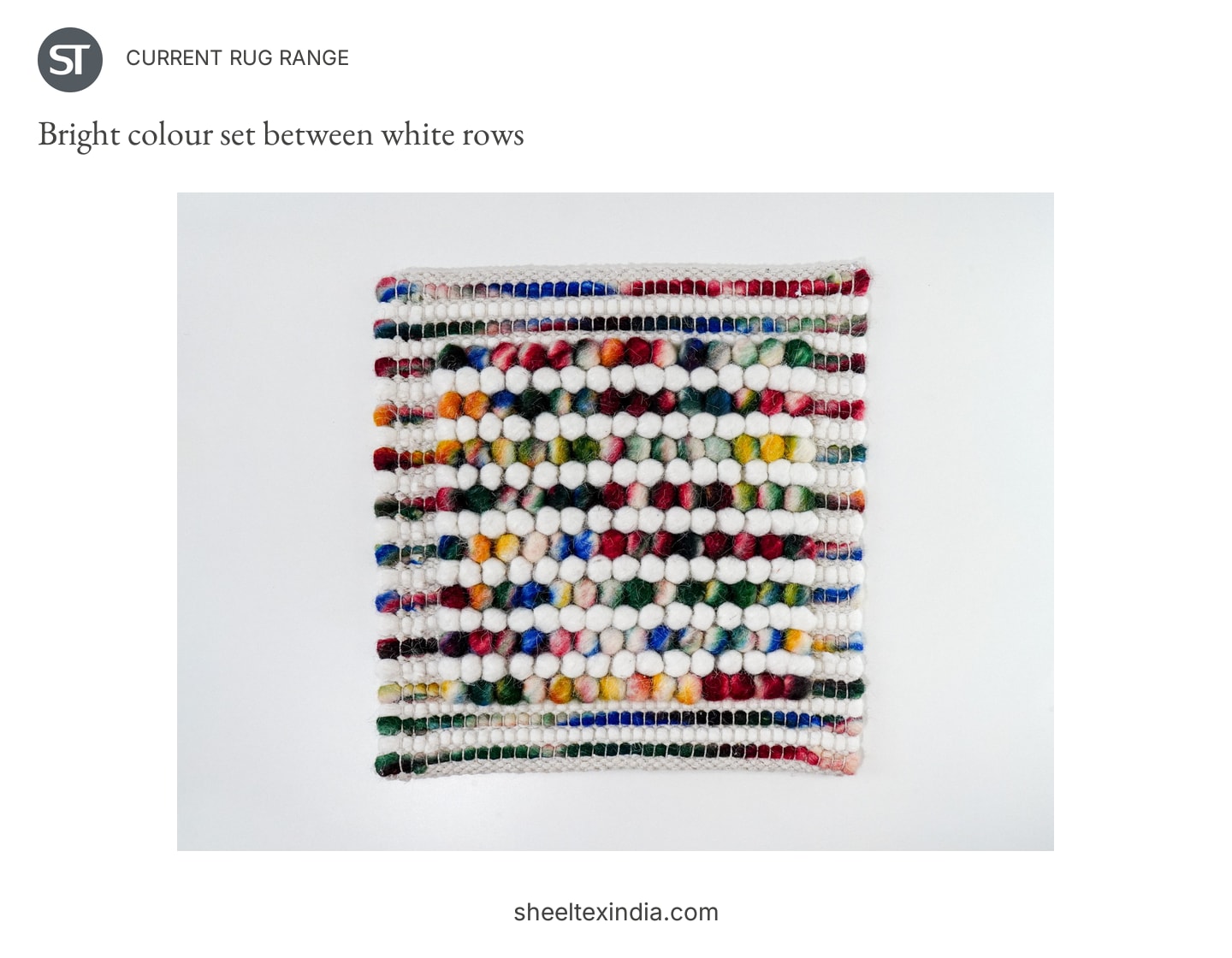
The white separates the bright colours, allowing each row to remain distinct. The low-angle detail shows the relief of the white rows and the coloured sections between them. Colour is organised here rather than scattered through the face.
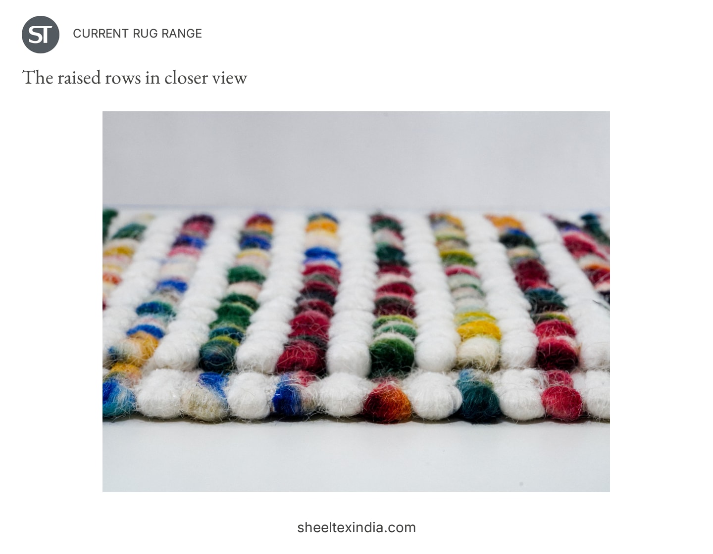
Shortlist this design if the range needs a more explicit pattern and brighter palette. One plain blue or green textile would echo a colour in the rows; ivory would emphasise the white intervals. Repeating every bright shade across the accompanying accessories could make the display busier than it needs to be.
A buyer already selecting several striped cushions or throws might prefer one of the first two rugs for variety. A display of mainly plain textiles gives these rows room to become the main pattern. The choice depends on what the rug will sit beside, not on the number of colours it contains.
Which look belongs in your range?
The comparison below puts the three samples together: small rounded forms and blended colour on the left, larger loops and pale ends in the centre, then bright rows separated by white on the right.
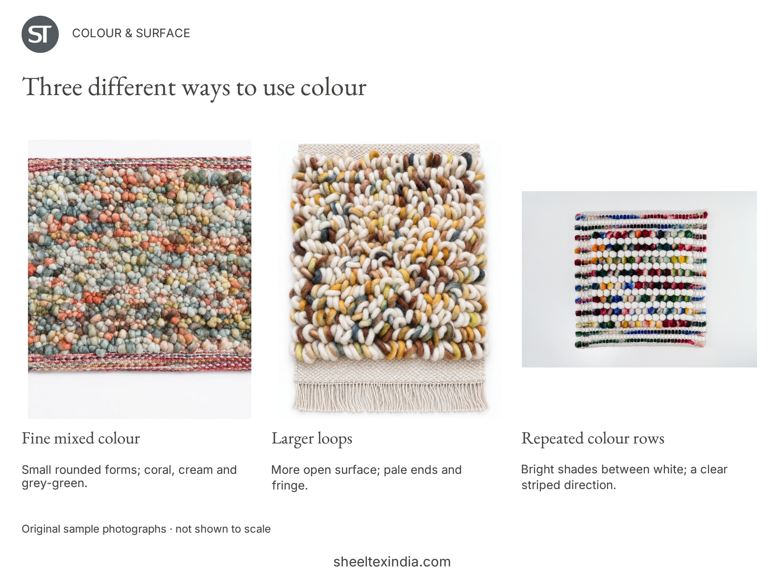
If you are extending a muted collection, start with the first sample. If you want a more visible surface, compare the second against the textiles already selected. If your display needs stronger colour and a clear stripe, start with the third. A range can include more than one of these looks, but each should add a difference that is easy to explain in a photograph and a short product description.
Browse our rugs and carpets collection for the broader selection. To discuss these designs, send a sample enquiry with the photograph you prefer, intended sizes, approximate quantity and destination country. A physical sample will help you judge the feel and colour alongside your own fabrics before settling the selection.
Frequently Asked Questions
How can a colourful rug work in a muted retail collection?
Start with finely mixed shades rather than a strong repeated pattern. The first wool sample combines pale coral, cream and grey-green in small rounded forms. Pairing it with a plain textile in one of those colours would keep the overall selection quieter.
What is the visual difference between the two wool rug samples?
The first has small, closely packed rounded forms and more blended colour. The second has larger, more open loops, stronger light and dark patches, and pale fringed ends. A whole-sample view and a close detail make the distinction easier to judge.
Which of these designs offers a clearer striped pattern?
The handwoven wool and cotton sample has bright colour rows separated by raised white rows. It offers a more regular striped direction than the mixed surfaces of the two wool samples.
How should buyers compare these rugs with cushion covers?
Choose one shared colour first. Clay or grey-green could accompany the fine mixed-colour sample; mustard or blue could accompany the larger loops; blue, green or ivory could accompany the striped sample. Compare physical samples together before choosing the final pairing.
Enquire about your collection or project
Tell us which products you need, your preferred sizes, quantities and destination. You can also share your collection or project requirements.
Make it part of your
next collection.
Share the designs you like, approximate quantities and destination. Let’s discuss samples, pricing and custom options.
