
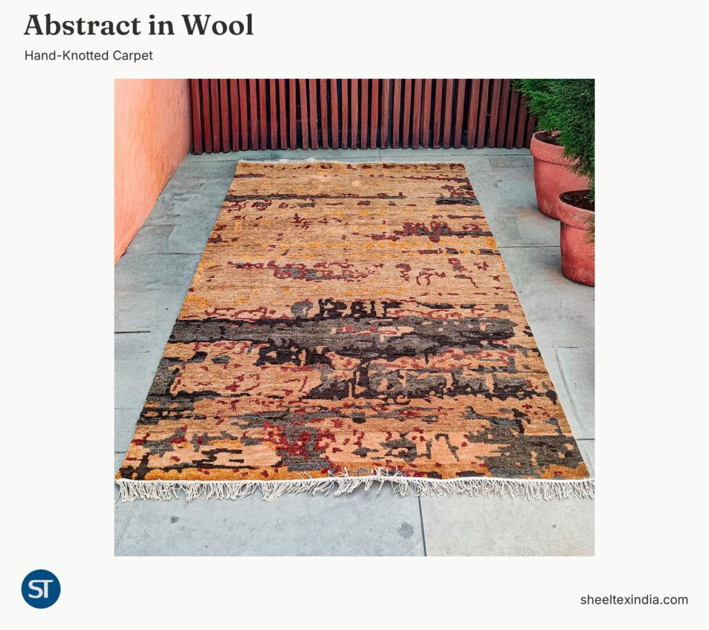
Charcoal shapes gather across one half of this abstract wool carpet, while more of the peach ground remains visible at the other end. Smaller burgundy and ochre marks move between the two. For an interior designer choosing a warm carpet for a furnished apartment, the question is where that larger dark area should sit in the composition.
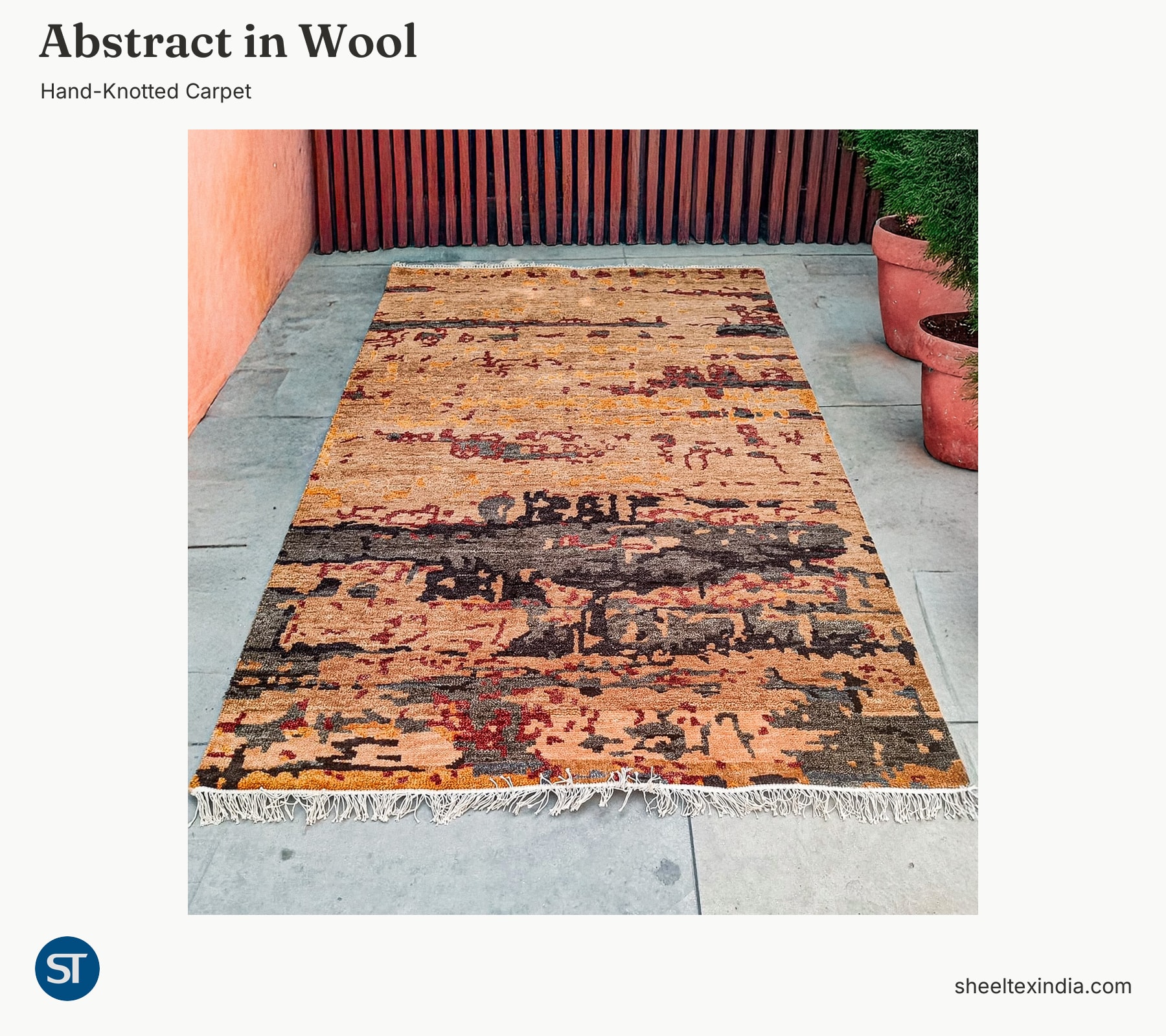
The design is part of Sheeltex’s current hand-knotted range and is made in 100% wool. The photographed reference measures 60 × 90 cm. Its complete overhead view shows the pattern distribution more clearly than the angled photograph, which brings one end closer to the camera.
Two ends with different amounts of pattern
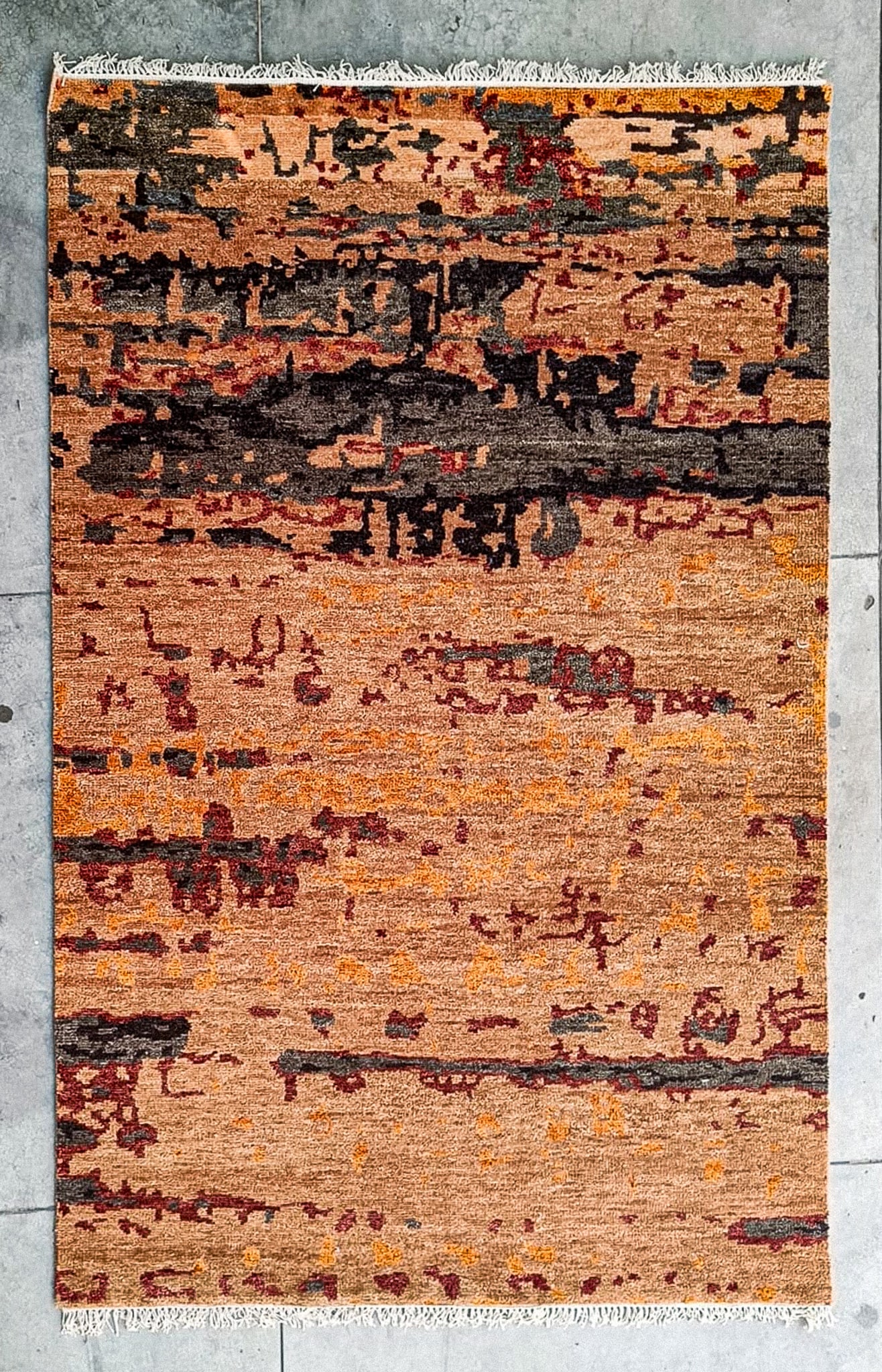
In the overhead photograph, the broadest charcoal and grey shapes sit above the middle. Below them, peach occupies longer stretches between the smaller marks. Burgundy lines connect some of the fragments, but they do not form a continuous border. The white fringe marks the two short ends.
That uneven distribution gives the designer a choice. With the darker half nearest the main approach, the charcoal shapes become the first strong element the eye meets. Turn the reference through half a turn and the more open peach area comes forward. The palette stays the same, but the balance changes.
This is worth considering before developing the design at a project size. A solid coffee table or ottoman placed over the broad dark area would hide much of its effect. An open-legged table would allow more of those shapes to remain visible. Compare the full composition with the furniture positions you intend, including what will be seen from the doorway.
Burgundy runs through the smaller marks
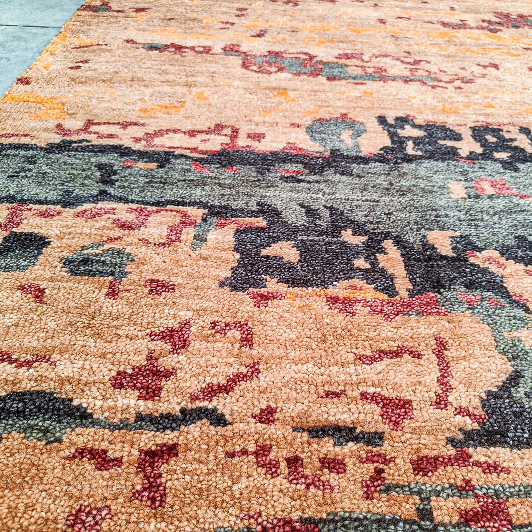
Closer in, the dark areas break into grey and near-black yarn, and the peach ground contains small changes in tone. The burgundy marks have irregular outlines. This smaller detail gives the surface interest between the larger shapes, so a tiny colour crop would miss how the design works across the whole face.
For a room palette, try pale oatmeal upholstery with dark timber. The upholstery would relate to the lighter ground, while the timber could pick up the charcoal. Use burgundy sparingly in a smaller textile or artwork if you want a link to the finer marks. Compare those finishes against the actual sample in the room’s light.
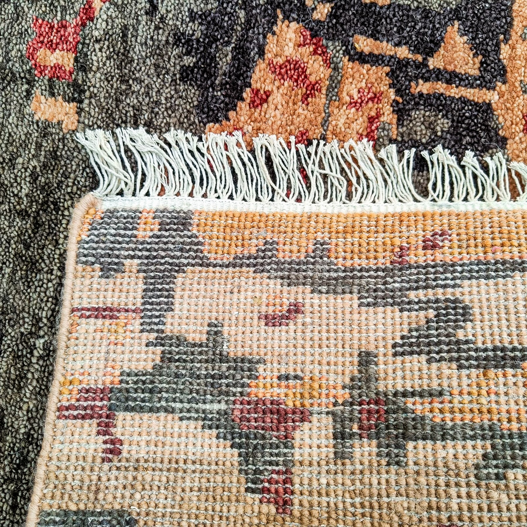
The folded detail shows the reverse, the finished side edge and the white fringe together. Keep that view with the face photographs when discussing the carpet, so the finish receives the same attention as the palette.
Explore other hand-knotted carpet designs or discuss a sample and project size with your intended dimensions, furniture layout, quantity and destination.
Frequently Asked Questions
What is this abstract carpet made from?
This design is hand-knotted in 100% wool. Compare a physical sample for its colour, surface and finish.
Can the design be discussed in a larger size?
Yes. The reference size is 60 × 90 cm, and other sizes can be discussed. Share the intended dimensions and furniture layout so the distribution of the larger dark shapes can be considered at that scale.
What minimum order applies to this design?
This design lists a minimum order quantity of one. Confirm the required size, sample arrangements and project quotation with Sheeltex.
Enquire about your collection or project
Tell us which products you need, your preferred sizes, quantities and destination. You can also share your collection or project requirements.